Showing posts with label color. Show all posts

Pantone Color of the Year 2014: Radiant Orchid


Pantone Institute, the global authority in colors, has announced the color of the year 2014: Radiant Orchid. The official name of the pinky purple is PANTONE 18-3224.

"While the 2013 color of the year, PANTONE 17-5641 Emerald, served as a symbol of growth, renewal and prosperity, Radiant Orchid reaches across the color wheel to intrigue the eye and spark the imagination", said Leatrice Eiseman, executive director of the Pantone Color Institute. "An invitation to innovation, Radiant Orchid encourages expanded creativity and originality, which is increasingly valued in today’s society. An enchanting harmony of fuchsia, purple and pink undertones, Radiant Orchid inspires confidence and emanates great joy, love and health. It is a captivating purple, one that draws you in with its beguiling charm".

According to the Pantone Color Institute, Radiant Orchid’s rosy undertones radiate on the skin, producing a healthy glow when worn by both men and women. Blending cool and warm undertones, purple is flattering to many hair, eye and skin tones.
This wonderful hue is very seductive when combined with red and pairs really well with shades of lavender, purple and pink. It's a perfect color for lipstick, blush and nails.

In interior design, Radiant Orchid can be used in paint, accent pieces and accessories. It complements olive and deeper hunter greens and it's a great combination with turquoise, teal and light yellows, according to Pantone. Also, it livens up neutral colors as gray, beige and taupe.

Radiant Orchid is one of the colors in the color palette of spring 2014.


Enjoy Radiant Orchid!

How to use colours in interior design - Part 2: Colour contrast


When designing a room, we also have to consider the colour contrast. Contrast if the difference in luminace and/or colour that makes an object - or its representation - distinguishable.

Johannes Itten was one of the first people to define and identify strategies for successful colour combinations. So, he found out that there are seven kinds of contrast.

1. Contrast of hue


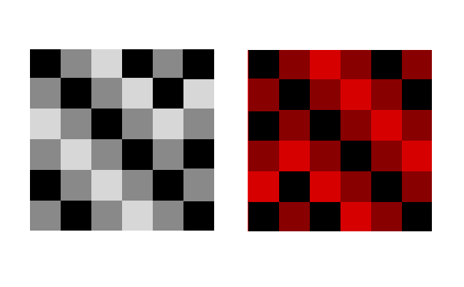
The greater the distance between hues on a color wheel, the greater the contrast. A great is example is black-white or even yelllow-red-blue.


2. Contrast light-dark

It is based on the use of different brightnesses and tone values of the colours. All colours can be lightened with white, and darkened with black. Example: black-white or yellow - violet.

3. Contrast cold-warm


It´s greatest effect is achieved with the colours orange-red and blue-green.

Warm colours
are made with orange, red, yellow and combinations of them all. They are considered warm because they make you think of sunlight and heat. Warm colours are used to make large rooms cozier.


Cool colours, such as blue, green and light purple have the ability to calm and soothe and they remind us of water and sky. They are great for small room to seem larger.


Using the cold-warm contrast brings balance to room. So, if you want your room to be cozy, have warm colours as the dominant ones and add a few elements with cool colours to balance them / or vice versa.


4. Complementary contrast

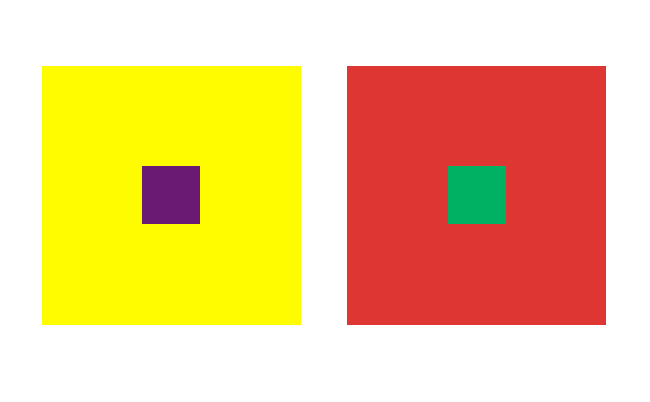
In the colour wheel, the complementary colours occupy opposite positions. When they are mixed, the result is a neutral grey-black. When adjacent, complementary colours mutually intensify their luminosity.

Example:
Yellow-violet
Blue -orange
Red-green


5. Simultaneous contrast (optical illusion)

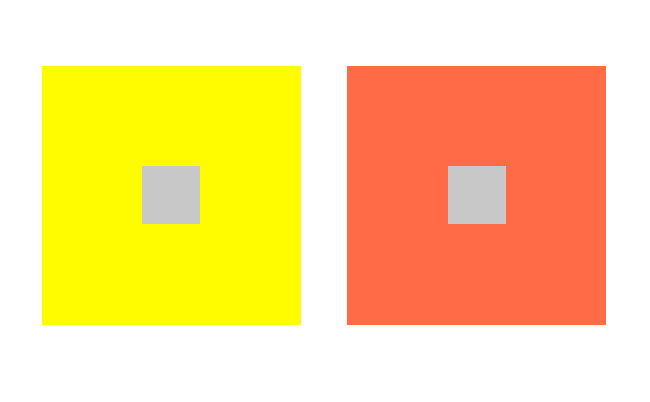
Its effect is derived from the law of complementary colours, according to which each pure colour physiologically demands its opposite colour – its complement. If this colour is absent, the eye will produce it simultaneously. Strong green makes neutral grey next to it appear reddish-grey, whereas the effect of strong red on the same grey is a greenish-grey appearance.


6. Contrast of saturation
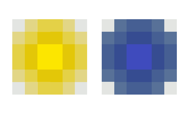
This is a contrast between luminous and dull colours. Colours can be subdued by the addition of black, white, grey or complementary colours.

7. Contrast of extention/quantity
It involves the proportion of colours used. Two factors determine the force of a pure colour> its brilliance or lightness of value and its extent. 


COMING NEXT:

How to use colors in interior design - Part 3: The color psychology - The meaning of colors

How to use colors in interior design - Part 1: The basic color theory


Before using colors in interior design, is good to know some important facts about them.

The 3 primary colors are red, blue and yellow. They cannot be made by mixing any other colors. These three colors are mixed to create all other colors and can be combined with white or black to create tints (lighter hues) and shades (darker hues) of these colors.

Secondary colors are created mixing two of the three primary colors together. They are orange, green and purple.


Example of a room using primary colors

Tertiary colors are made by mixing one primary color with one secondary color. These colors are red-orange, yellow-orange, yellow-green, blue-green, blue-violet and red-violet.


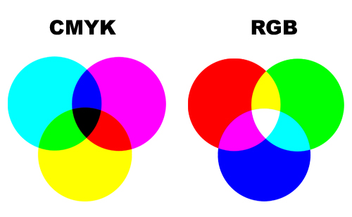
Additive primary colors are the primary color elements that make up white light. These colors are called additives because you must add the colors together to create white. The additive primary colors are red, green, and blue (commonly called RGB) as they are the primary color elements.


In contrast to combining the additive primary colors of red, green, and blue to make white, subtractive primary colors is a four-color printing process that uses cyan, magenta, yellow and black. This is often referred to as CMYK.


So, these are the hues, or the twelve purest and brightest colors.They form the full spectrum of colors which progress around the Primary Color Wheel in gradual increments.


When speaking about colors, we have to know that every color on the Basic Color Wheel can be altered in three ways by tinting, shading or toning.

A tint is a mixture of pure hue and white. Think of a color like red saturated with lots of white. As more white is added the color becomes a lighter and lighter tint of red, until it turns to pale pink.


The shade of a color refers to how dark it is. It is the combination of a hue and black. Thus, burgundy is a shade of red, hunter is a shade of green, and rust is a shade of orange.


Shades of a color offer a deeper and richer feeling in decorating and can be used to make any room feel cozier.

A tone is created by adding both white and black which is grey. Any color that is "greyed down" is considered a Tone.


Complementary colors are pairs of colors that are of  "opposite" hue. In color theory, two colors are called complementary if, when mixed in the proper proportion, they produce a neutral color (grey, white or black). Example of complementary colors:
  •     red and green
  •     blue and orange
  •     purple and yellow
 

Then, we have the analogous colors. Three colors next to each other on the color wheel comprise an analogous color scheme. Here are three examples:

  •     red, orange, and yellow
  •     green, blue, and purple
  •     yellow, yellow-green, and green


In an analogous color scheme, usually one color is dominant and the others secondary in importance.

COMING NEXT:

How to use colors in interior design - Part 2: Color contrast
How to use colors in interior design - Part 3: The color psychology - The meaning of colors


References:

wikipedia.org
interiordec.about.com
color-wheel-artist.com