Showing posts with label home design. Show all posts

How to use colours in interior design - Part 2: Colour contrast


When designing a room, we also have to consider the colour contrast. Contrast if the difference in luminace and/or colour that makes an object - or its representation - distinguishable.

Johannes Itten was one of the first people to define and identify strategies for successful colour combinations. So, he found out that there are seven kinds of contrast.

1. Contrast of hue


The greater the distance between hues on a color wheel, the greater the contrast. A great is example is black-white or even yelllow-red-blue.


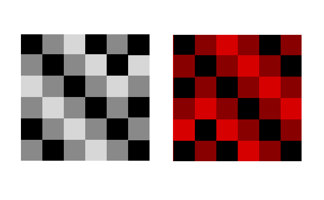
2. Contrast light-dark

It is based on the use of different brightnesses and tone values of the colours. All colours can be lightened with white, and darkened with black. Example: black-white or yellow - violet.
3. Contrast cold-warm


It´s greatest effect is achieved with the colours orange-red and blue-green.

Warm colours
are made with orange, red, yellow and combinations of them all. They are considered warm because they make you think of sunlight and heat. Warm colours are used to make large rooms cozier.


Cool colours, such as blue, green and light purple have the ability to calm and soothe and they remind us of water and sky. They are great for small room to seem larger.


Using the cold-warm contrast brings balance to room. So, if you want your room to be cozy, have warm colours as the dominant ones and add a few elements with cool colours to balance them / or vice versa.


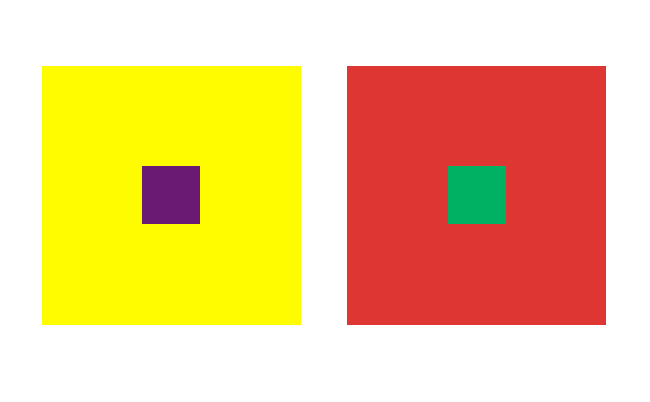
4. Complementary contrast

In the colour wheel, the complementary colours occupy opposite positions. When they are mixed, the result is a neutral grey-black. When adjacent, complementary colours mutually intensify their luminosity.

Example:
Yellow-violet
Blue -orange
Red-green


5. Simultaneous contrast (optical illusion)

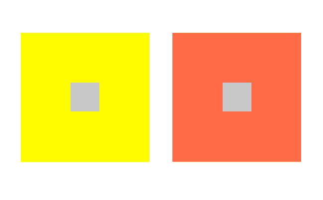
Its effect is derived from the law of complementary colours, according to which each pure colour physiologically demands its opposite colour – its complement. If this colour is absent, the eye will produce it simultaneously. Strong green makes neutral grey next to it appear reddish-grey, whereas the effect of strong red on the same grey is a greenish-grey appearance.


6. Contrast of saturation
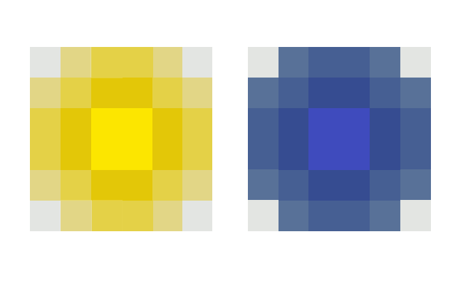
This is a contrast between luminous and dull colours. Colours can be subdued by the addition of black, white, grey or complementary colours.
7. Contrast of extention/quantity
It involves the proportion of colours used. Two factors determine the force of a pure colour> its brilliance or lightness of value and its extent. 

COMING NEXT:

How to use colors in interior design - Part 3: The color psychology - The meaning of colors

How to design your house in the romantic style

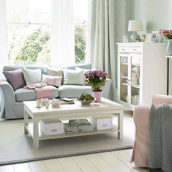
The romantic interior design style is very delicate: soft fabrics, floral patterns, painted furniture, pastel colours and lots of nice smelling flowers!

How can you obtain the romantic style:


- Use soft, pastel colours
- The romantic style is a femminin one, but this doesn't mean men don't like it. To have a room for both women and men, use some furniture with round shapes, mixed with stripes, a huge chair and dark wood accessories. Louis XVI furniture is a very appropriate one for the romantic style!
- The fabrics are very important for this style - the silk is the favourite of the designers, especially for the pillows. In the bedroom, you can use matelasse or velvet.
- The decorations are essential for the romantic feeling. You can use pearly shells, mirrors, silver photo frames and silver flower vases, and never forget the real flowers!
- The windows have big and beautiful curtains.

Here you have some nice decor ideas:


Colours of the spring 2013: How to design your home in the spirit of the season

Pantone showed us which are the trending colours for the spring 2013. We offer you some ideas of interior design using these wonderful colours.

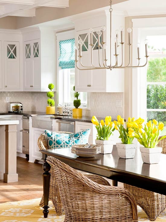
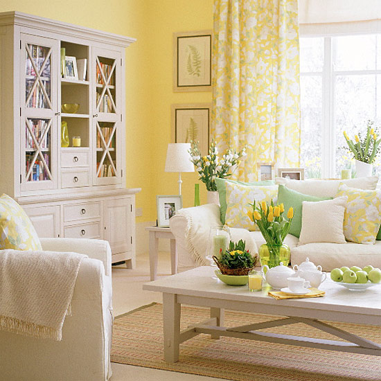
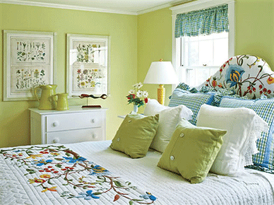
As you know, spring is the season of the fresh and joyful colours, mainly green, yellow and pin. This year is not an exception. So, this spring's trending colours are: Emerald (2013 colour of the year), Dusk Blue, Tender Shoots, Grayed Jade, African Violet, Lemon Zest, Linen, Poppy Red, Monaco Blue and Nectarine.

The interior design for the spring 2013 is also influenced by the nature: we should use a lot of wood, natural fibers and natural, simple fabrics.

The rooms have to be very bright, with a lot of light - both natural and artificial. Don't forget about the flowers - a spring is not a real spring without them. So use them everywhere: in the pots, in the vase or on the fabrics.


How to transform a small house in a larger one

Most of our homes ar not too big, so it's very important to know how to design them to seem much larger.

In a small house we have to use only the necessary, we have to pay attention to the colours and mostly, to the lighting.

1. Use light colours


Light colours offer the illusion of a bigger and brighter room. White is the best for creating this effect, but they're also some nice and delicate colours combinations like pastels. The designer's favourite combination is cream and light blue.

2. The light


Space may seem bigger if you let the natural light come into the house. If you don't have a nice natural light, you can use the artificial lighting as much as possible.

3. Have an organised home, without clutter.
4. Create a focal point: for example, in the kitchen the focal point is the table, in the bedroom - the bed. So concentrate on these areas and don't use to many decorations in the others.

5. Use mirrors. Mirrors reflect the light and the space, so a room will seem brighter and bigger.

6. Use multifunctional furniture, like chests that can be used as coffee tables.

7. Advices for the furniture: Use extandible tables and pliable chairs. Don't use big pieces of furniture or too many decorations and don't block the walking paths. It's also very important to leave free the center of the room. It would be nice to have some pieces of furniture with the same colour of the walls. You can also use tranlucid furniture, as tables or chairs, for the illusion of space.