
Before using colors in interior design, is good to know some important facts about them.
The 3 primary colors are red, blue and yellow. They cannot be made by mixing any other colors. These three colors are mixed to create all other colors and can be combined with white or black to create tints (lighter hues) and shades (darker hues) of these colors.
Secondary colors are created mixing two of the three primary colors together. They are orange, green and purple.


Example of a room using primary colors

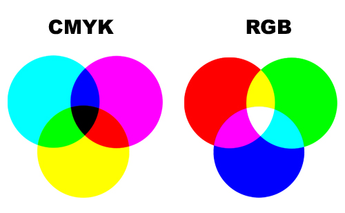
Additive primary colors are the primary color elements that make up white light. These colors are called additives because you must add the colors together to create white. The additive primary colors are red, green, and blue (commonly called RGB) as they are the primary color elements.
In contrast to combining the additive primary colors of red, green, and blue to make white, subtractive primary colors is a four-color printing process that uses cyan, magenta, yellow and black. This is often referred to as CMYK.
So, these are the hues, or the twelve purest and brightest colors.They form the full spectrum of colors which progress around the Primary Color Wheel in gradual increments.

When speaking about colors, we have to know that every color on the Basic Color Wheel can be altered in three ways by tinting, shading or toning.
A tint is a mixture of pure hue and white. Think of a color like red saturated with lots of white. As more white is added the color becomes a lighter and lighter tint of red, until it turns to pale pink.

The shade of a color refers to how dark it is. It is the combination of a hue and black. Thus, burgundy is a shade of red, hunter is a shade of green, and rust is a shade of orange.

Shades of a color offer a deeper and richer feeling in decorating and can be used to make any room feel cozier.
A tone is created by adding both white and black which is grey. Any color that is "greyed down" is considered a Tone.

Complementary colors are pairs of colors that are of "opposite" hue. In color theory, two colors are called complementary if, when mixed in the proper proportion, they produce a neutral color (grey, white or black). Example of complementary colors:
- red and green
- blue and orange
- purple and yellow


Then, we have the analogous colors. Three colors next to each other on the color wheel comprise an analogous color scheme. Here are three examples:
- red, orange, and yellow
- green, blue, and purple
- yellow, yellow-green, and green


In an analogous color scheme, usually one color is dominant and the others secondary in importance.
COMING NEXT:
How to use colors in interior design - Part 2: Color contrast
How to use colors in interior design - Part 3: The color psychology - The meaning of colors
References:
wikipedia.org
interiordec.about.com
color-wheel-artist.com